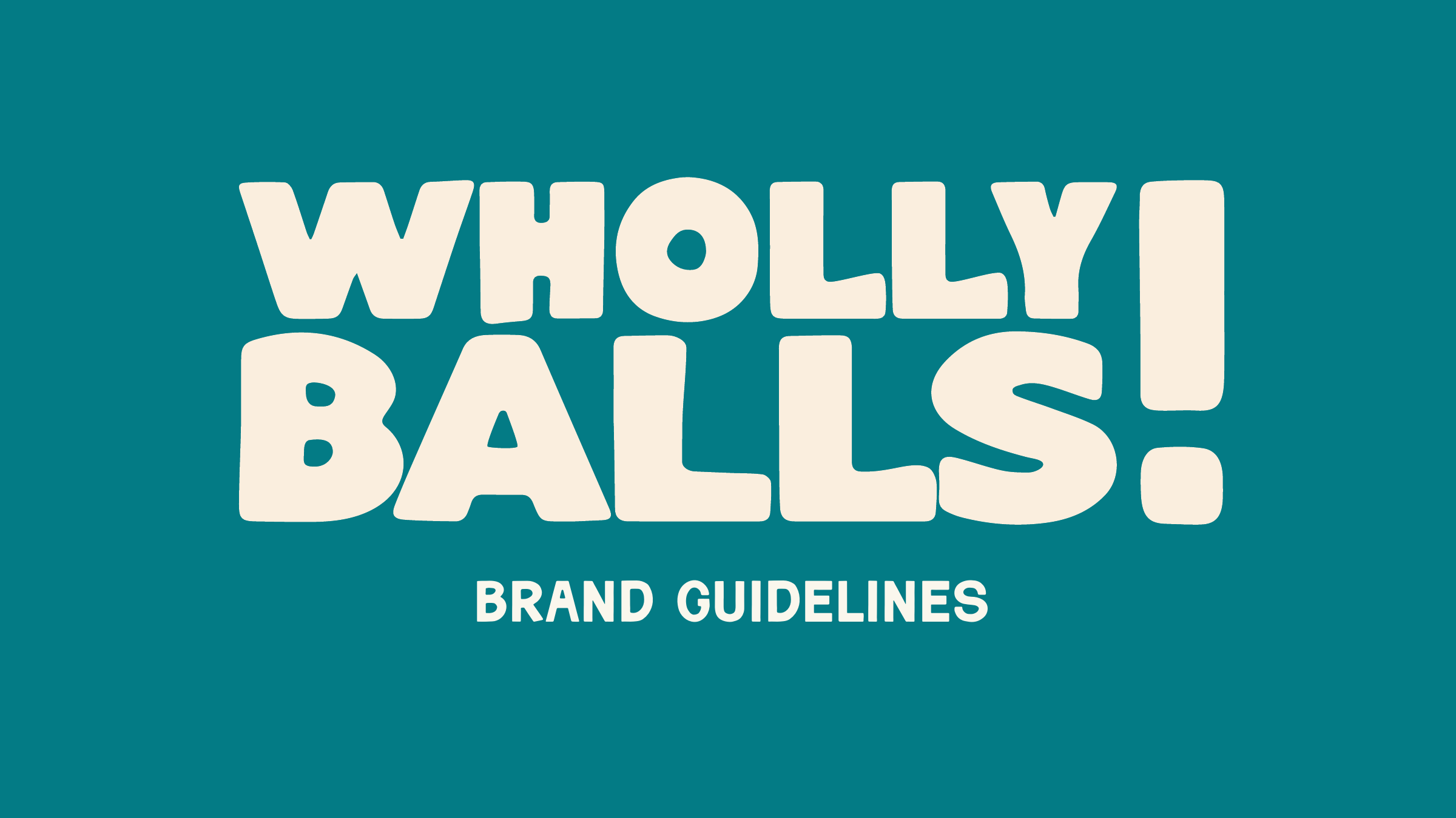
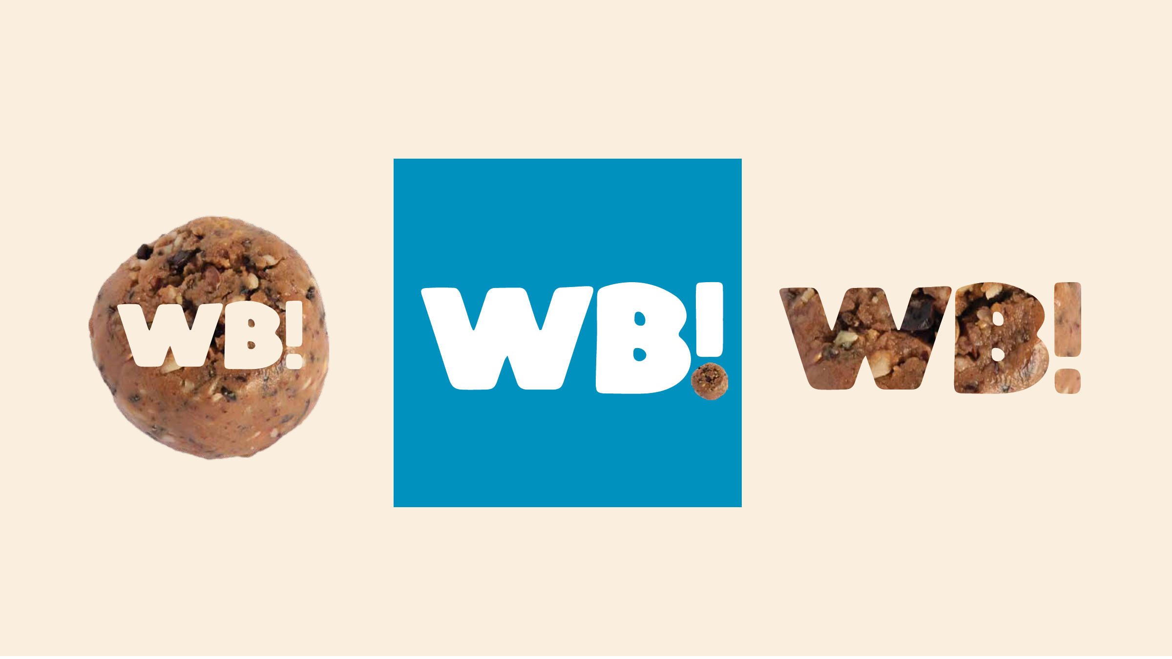
Wholly Balls: A snack brand with actual bite.
A loud, playful identity system for protein bites that needed to feel craveable, not clinical.
The Problem
Protein brands can get painfully serious. Wholly Balls needed to keep the functional promise of a protein bite while making the product feel joyful, flavorful, and easy to remember.
The name gave us permission to be bold. The work was about making that boldness useful: recognizable on a shelf, flexible for packaging and flavor systems, and still clean enough to feel like a real food brand.
The identity had to feel like a treat without losing the nutrition cue.
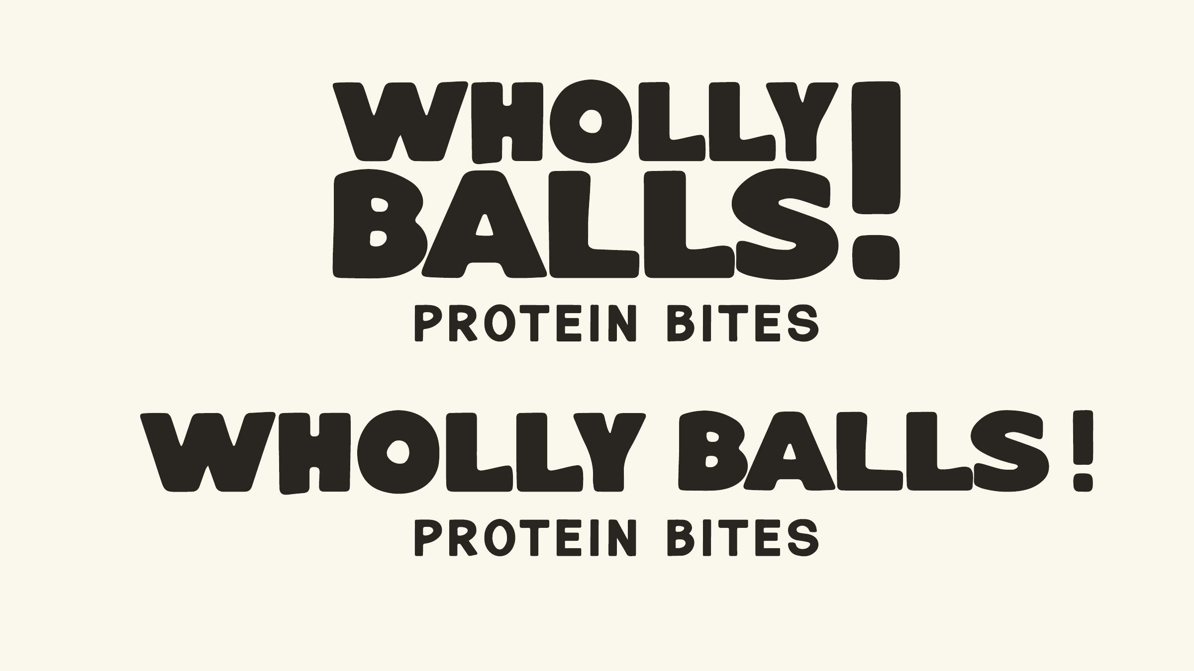
The System
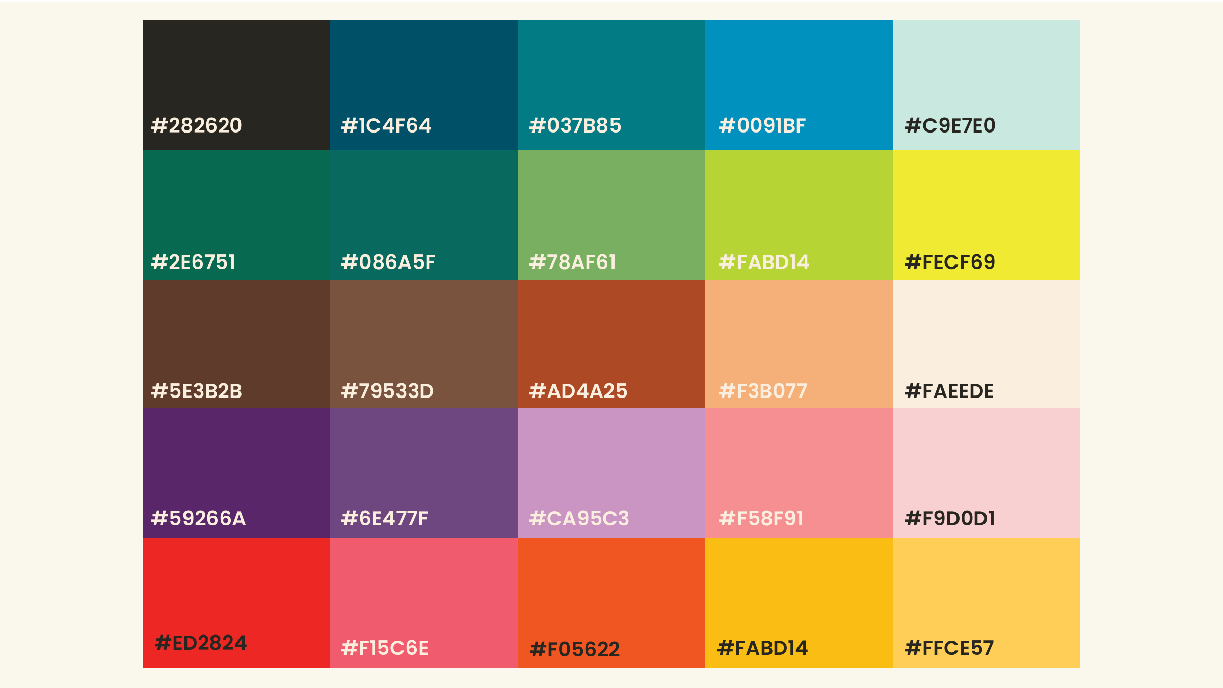
The system pairs a heavy, bubbly wordmark with a wide color palette, topographic texture, and simple supporting typography. It gives the brand the range to be silly, seasonal, outdoorsy, or ingredient-led without losing the core voice.
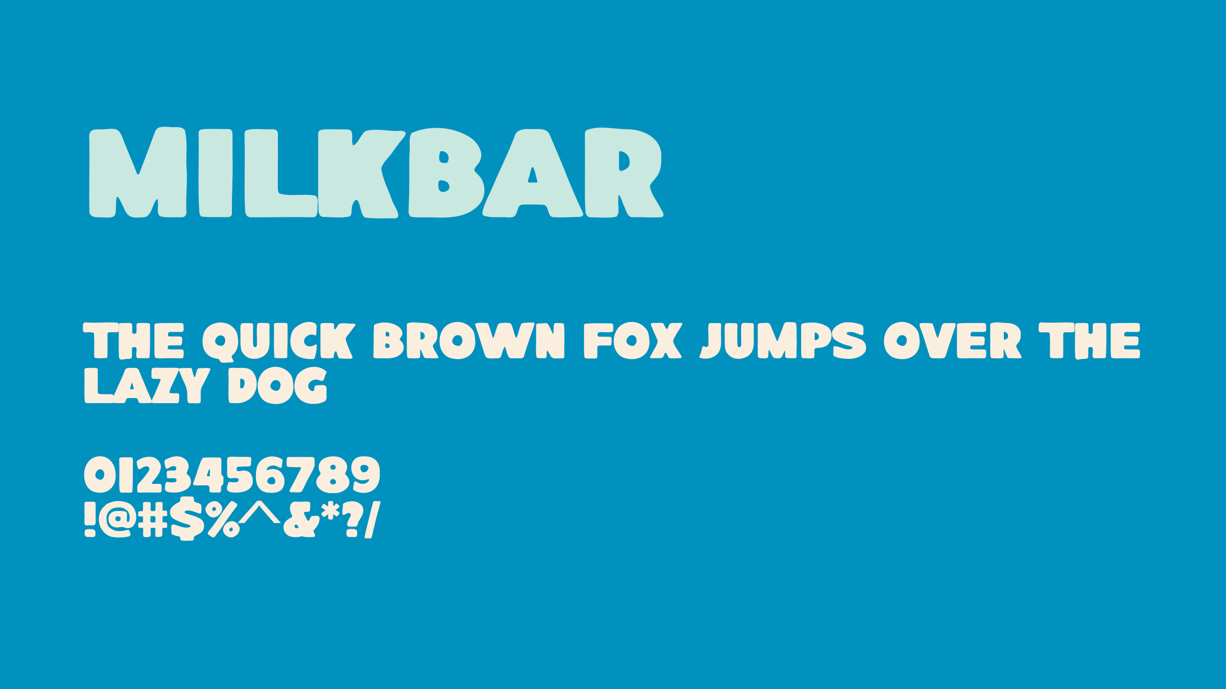 Milkbar
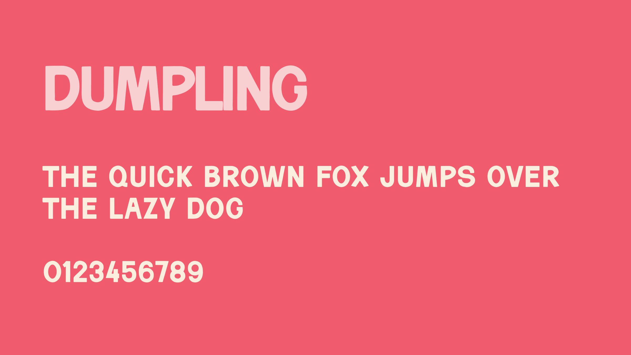 Dumpling
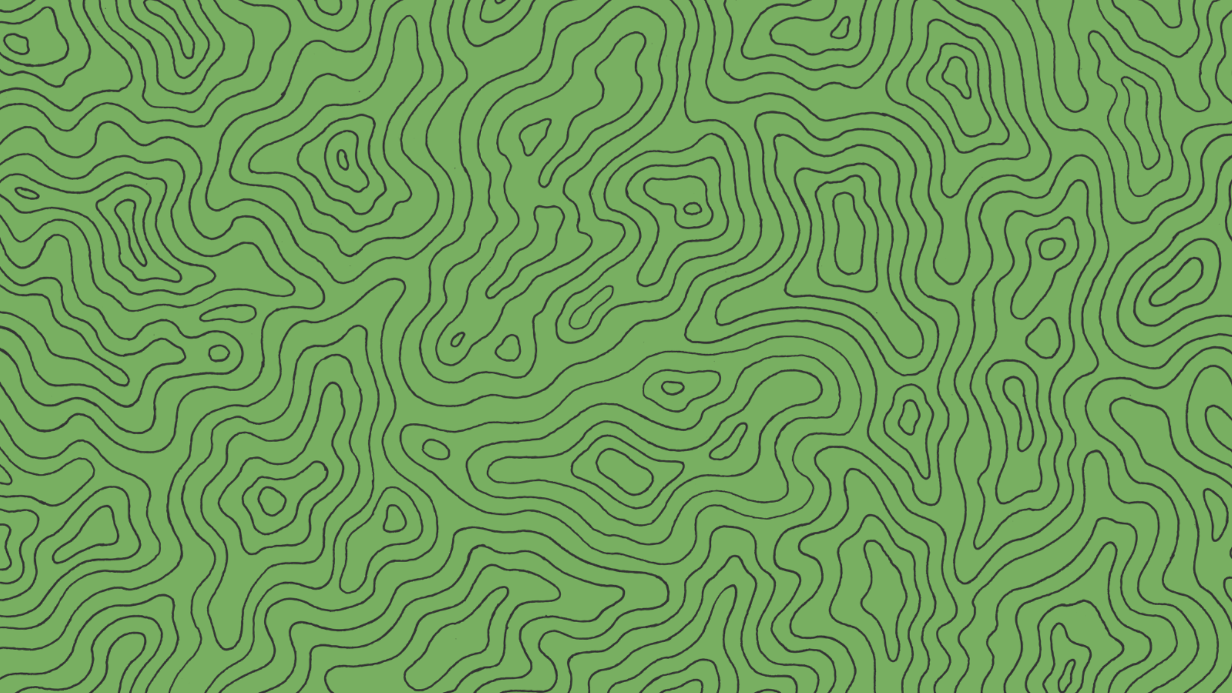 Pattern
 Support System
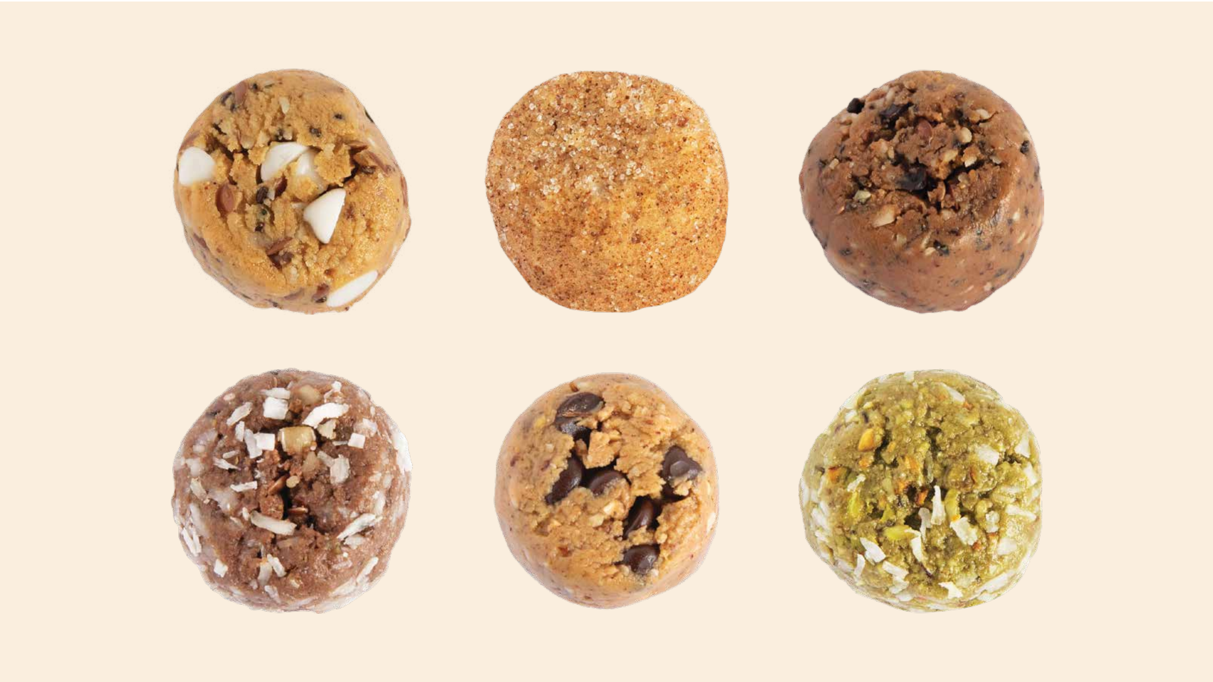
The Range
The system can move from close-up product appetite appeal to big scenic brand moments. That range matters for a snack brand that can live in packaging, social, outdoor content, and retail surfaces.
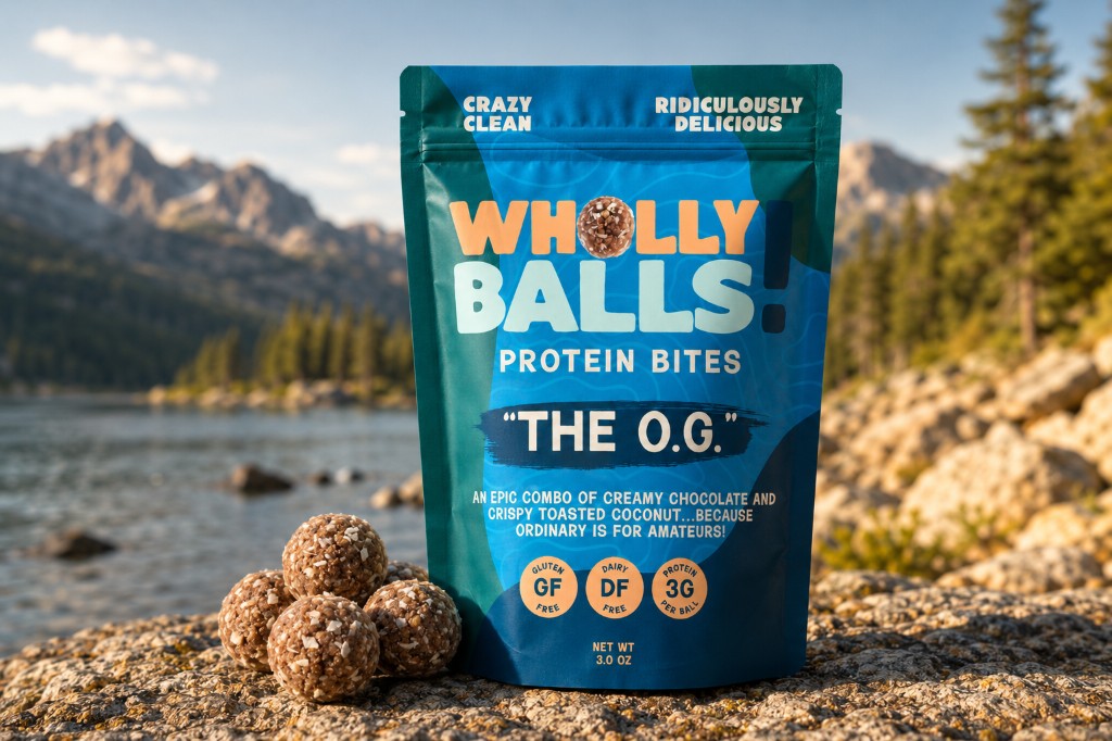 The O.G.
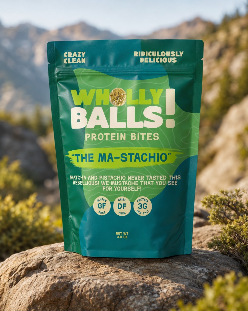 The Ma-stachio

The result is a protein bite brand with appetite appeal and memory. It looks fun because the product should feel fun.